Illustration Done Right: How to use illustration as a core part of brand identity
March 30, 2026
Illustration doesn’t just mean a quirky mascot or fun logo. It’s also not limited to brands aimed at younger audiences. Whether geometric, handdrawn, digital or flowing, illustration can shape a brand, creating a unique and expressive visual identity. At Candid Digital we use our own illustrations throughout our branding to help create a cohesive image across all platforms and show our creative approach to digital marketing. But why should you consider illustration for your brand toolkit? Here are just a few reasons….
It’s engaging. Grab your audience’s attention
Variation. Stop content from looking repetitive.
It allows your brand to generate more suitable content for all platforms- especially more visually based ones
Personality and fun. Create the tone for your brand through imagery.
Storytelling. Clearly communicate stories and ideas to stand alone or go alongside written content.
The ability to establish a clear visual identity that can be associated with your brand
Communicate without language as a barrier
Many successful brands have illustration at the core of their identity. Here are some examples of our very favourites.
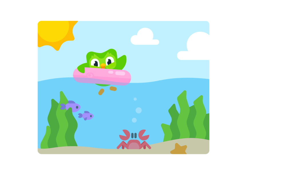
Duolingo
Duolingo wouldn’t be the same without Duo and the range of characters that make up the app. Bright colours and simple shapes make up the huge variety of illustrations, grabbing the attention of people all over the world. The characters that make up Duolingo are so well integrated into the app that it often feels more like a story or game than an educational tool. They replace an in person teacher without losing any personality, fun or engagement. There is also a focus on celebrating culture and highlighting its importance when learning a language. Without illustration, Duolingo could never make such a connection with users and keep people coming back to carry on their learning streaks.
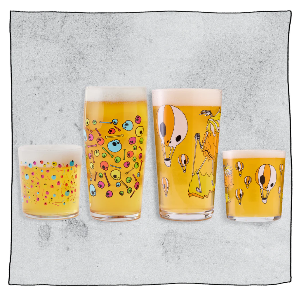
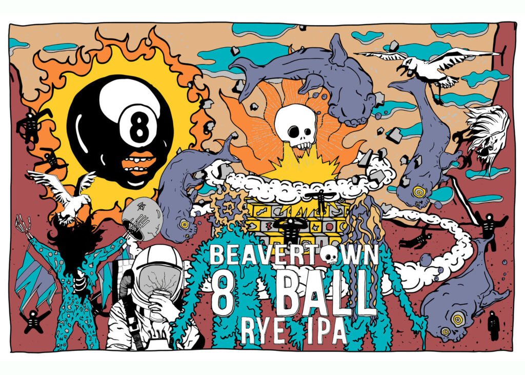
Beavertown
Illustration is at the core of Beavertown’s identity. Illustrator and creative director Nick Dwyer is responsible for the iconic brand identity made up of vibrant colours and experimental characters and objects. For something that started originally as packaging design, the distinctive style has allowed Beavertown to expand beyond just drinks. T-shirts, pint glasses and other merchandise is desirable and cool and Dwyer’s illustrations have become the foundation for Beavertown taprooms and advertising campaigns. You see a skull floating in space and think of Beavertown.
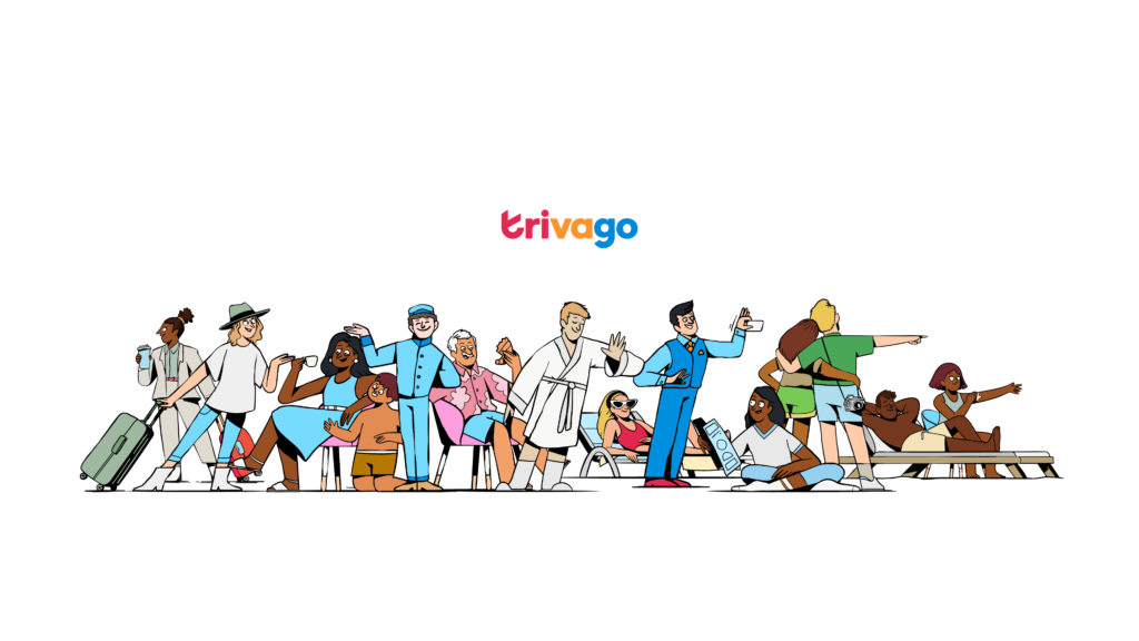
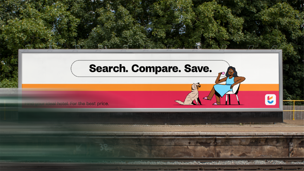
Trivago
With Trivago’s 2024 rebrand came a new illustration library designed by creative studio, Niceshit. Their new identity gives them a unique visual language that stands out from their industry competitors. The illustration style brings the brand to life with energetic scenes that feel fun and lighthearted. Each illustration tells a story and shows the joys of where you can end up after booking with Trivago and sets the tone for an easy and enjoyable booking experience.
Want to know more about how to transform your brand with illustrations? Contact us today.